Reconstruction of Our New Building: The Winning Solution
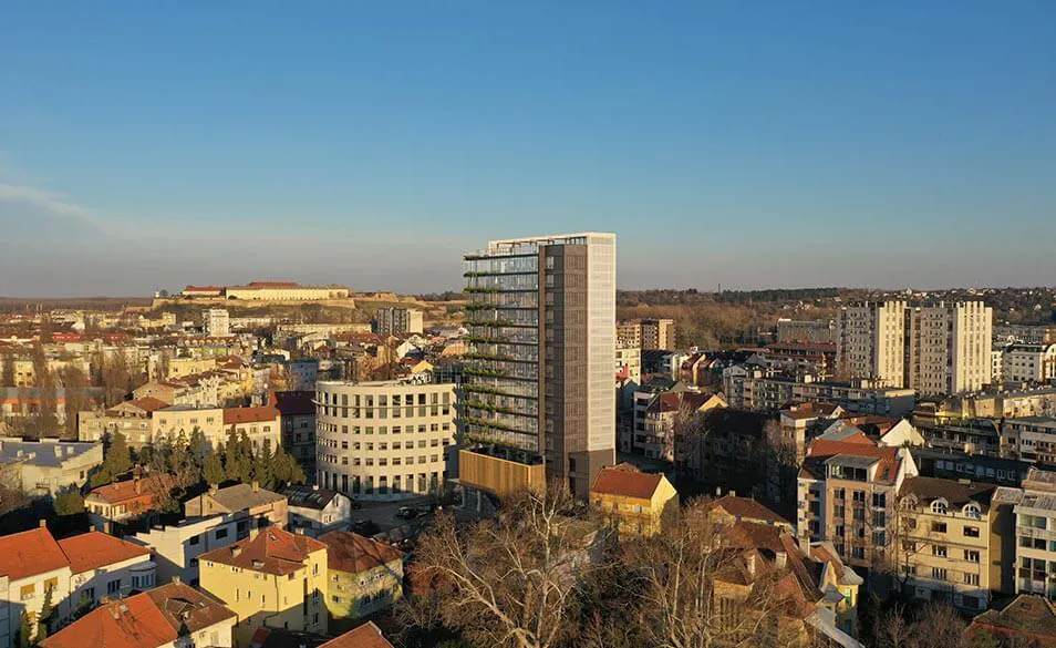
It’s official! We have a winning solution for the visual appearance of our new building and we are excited to share it with you.
Dear citizens of Novi Sad, we are proud to present you with the visual presentation of the winning solution for the former building of the Radnički Univerzitet.
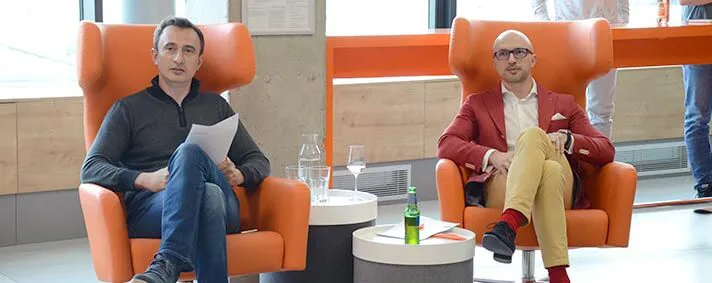
Winning design by Kuzmanov and Partners
Was this a difficult decision? Absolutely! This was a true photo finish and our jurors spent many hours analysing all four entries.
We would like to say thank you to all of the participants - we couldn’t have done this without you!
We believe that the elegant design and sleek lines of the building will stand the test of time and once again become one of the city’s highlights.
Now it’s time to see all of the solutions.
The Winning Design: Kuzmanov and Partners Studio (Visualisation: Case 3D)
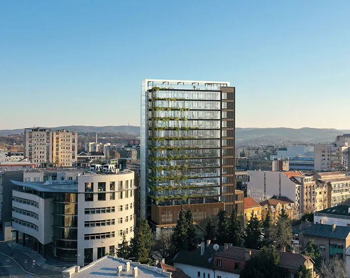
The Winning Design: Kuzmanov and Partners Studio
To find out why the jury chose this solution, we spoke to our CEO Saša Popović:
“When we thought about what the building would look like, we wanted it to be modern but also timeless.
Considering its location and the expectations our citizens have from that building, we wanted it to stand out from the rest but not to stick out.
We believe that transparency is highly important in business so we wanted this to be visible at first sight and through the building exterior.
Finally, all four solutions fulfilled our expectations, some of them exceeded them, and the solution delivered by Lazar Kuzmanov was our top favourite. We believe that the elegant design of their solution will make this building one of the city’s famous landmarks one more time. We hope that it will stand the test of time and that it will become a place which our citizens will speak proudly of in the upcoming years.”
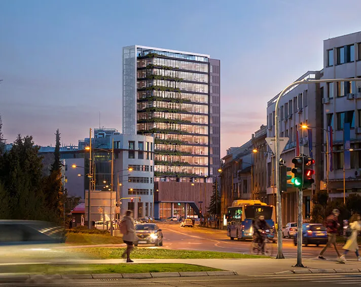
The Winning Design: Kuzmanov and Partners Studio
Read what the Senior Partner and Founder of Kuzmanov and Partners, Lazar Kuzmanov said about the inspiration for the winning design:
“The idea behind the new building’s architecture is to maintain the identity of the object through modern design recognisability and use of new materials and modern coverings.
When developing the solution, we were guided by the idea to maintain verticality of the object so that we would preserve slenderness of the composition. Introducing the frame that surrounds the object was both for functional and design purposes. This frame designed in this way distinguishes the object, frames it like a picture, and still functionally covers all the elements on the facade.
The main membrane of the object is the facade made of glass wall curtain, which resembles the rhythm and distribution of openings the previous building used to have. The verticality of the building facade is in the opposition with strong horizontals which are moved when compared to the existing dimensions of the base and, in this way, they make the front side of the building get the necessary dynamics.
A transparent glass facade allows everyone to feel the ambience of the interior from the outside as well, that is, it is also visible from the street.
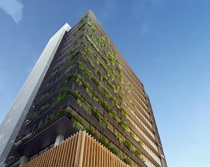
The Winning Design: Kuzmanov and Partners Studio
As a contribution to green building, this solution allows for landscaping of the object. Strong steel horizontals are also designed to be planters with plants. A building view from the city center, that is from the street of Modene, would be covered with that “green curtain”.
The attractive look of the object with minimalist architecture gives an impression of elegance and, in this way, both through its distinguished visual appearance and aesthetics it enables the recognisability of the Vega IT’s brand.”
Synthesis Quatro Design Proposal
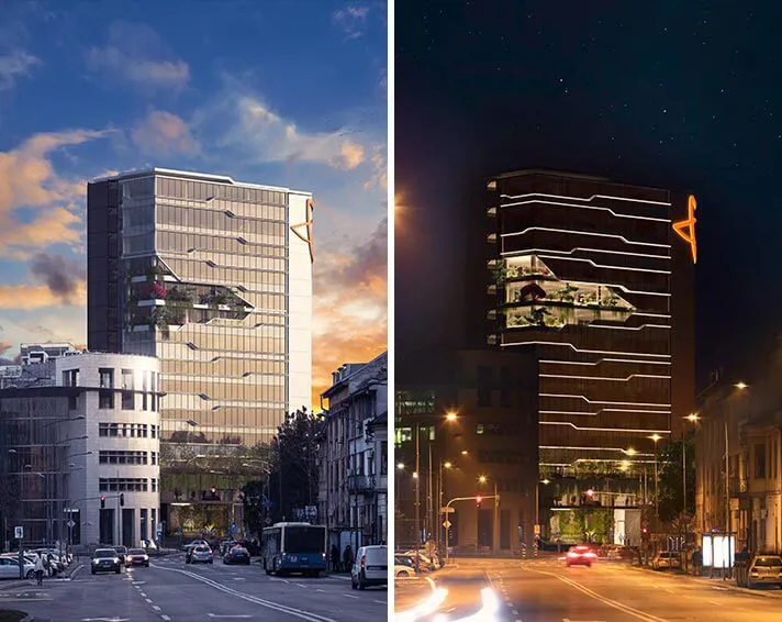
Synthesis Quatro Design Proposal
The idea behind the Synthesis Quatro design proposal:
“Through this building’s architecture we wanted to open a new chapter of futuristic architecture of Serbia (Vojvodina).
The object with its minimalistic horizontals and majestic clean lines makes peace between the local, autochthon architecture of this region and international skyscraper design. The complex supports the surrounding and corresponds to the artistic approach of architecture design.
As a homage to the building of “Radnički Univerzitet“ we maintained a visible construction as a part of the facade to remind us of the past.
Led by the concept of energy efficiency we paid particular attention to our selection of materials. We wanted this building to be entirely in glass and we remained consistent in our beliefs and visions.
Through an in-depth analysis, we reached the solution we are really proud of and driven by the energy of a well-organised team we created a conceptual solution of the building.”
Remorker Architects Design Proposal
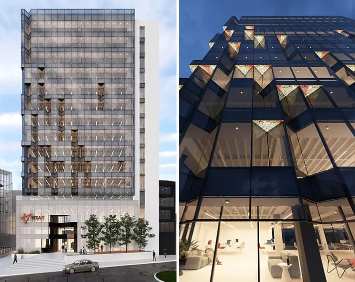
Remorker Architects Design Proposal
The idea behind the Remorker Architects design proposal:
“We believe that the architecture should reflect the society and that it should be the representation of its technical capabilities, philosophical basis as well as its aesthetic principles. We believe that the digital world which we, as a society, build very fast must influence creative processes in both architecture and design.
This influence brings us “digital” architecture solutions which are physical embodiments of our development and transformation in the virtual world.
Our conceptual solution divides the building in two parts. The ground floor and the first two floors represent a massive foundation which directly communicates with the street and pedestrians and it is covered with a foil with digital print. This large cube is “emphasised” with a massive entrance portal which is highly distinguished. Triangle shapes on the facade which the people would encounter at the entrance will appear on many floors as well. However, the way these are designed at the entrance portal indicates the aesthetics of fractals more than on the floors of the building. The combination of triangle shapes on some windows on the building’s facade creates extraordinary dynamics which catches the attention of passersby who are trying to define a potential presence of a rhythm in these irregularities.
The very position of these vertical triangular shapes is determined parametrically and is slightly emphasised in the bottom left corner, in the part of the facade which is mostly exposed to the public and which is oriented towards the busiest streets of the city. These shapes spread through a few floors which emphasises verticality and symbolizes aspirations to grow and succeed.”
Zabriski Studio Design Proposal
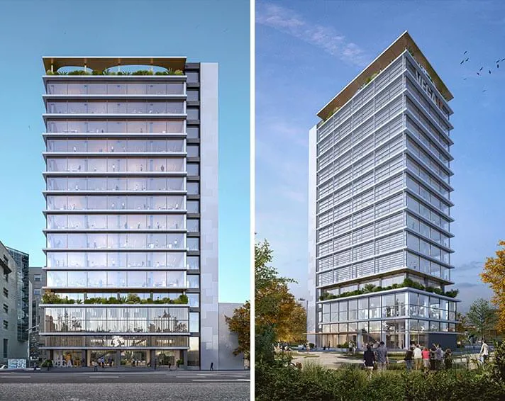
Zabriski Studio Design Proposal
The idea behind Zabriski Studio design proposal:
“To express the idea behind the company Vega IT, we chose minimal horizontal lines as a reminder of the old “blue beauty” of Novi Sad and as a representation of Vega IT values, that is their approach to recreating the symbol of Novi Sad.
Through basic elements of building construction which emphasise the feeling of freedom, excitement and inspiration in the inner space of the building, the object becomes a landmark - which is the ultimate phrase for successful and recognizable design.
The goal was to create a unique quality of space that would create the feeling of flying above the city - the most powerful and the most direct spatial and psychological effect which can be related to the concept of developing a vision.”
What’s Next?
Now, that we have chosen the design, we can move on to the phase #2 of reconstructing the building and phase #3 of creating a conceptual solution for the interior.
Stay tuned.


