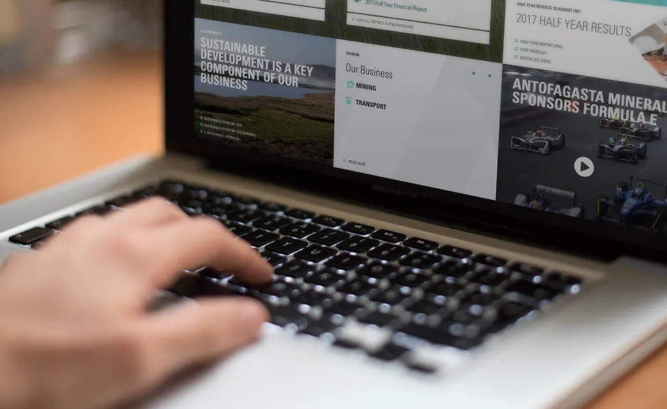
How we built an award-winning website for Antofagasta
Antofagasta wanted to create an intuitive website and online identity that could help them position even more firmly on the market. We were their technical partner in the process.

A Chile-based copper mining group, Antofagasta is the longest continuously listed business on the London Stock Exchange. It has been a constituent of the FTSE 100 since 2004. Its success is owed in part due to its commitment to generate value in a safe and sustainable way.
In recent years the company has improved the quality of its annual reporting. As its performance as a company gained widespread recognition, the time came for its corporate website to start making a similarly positive impression.
In collaboration with our partner, Emperor, and with the visual identity they built for Antofagasta, we have created a website and online identity that can help position the company even more firmly on the market. One of the results of this collaboration is the fact that the company’s website was honored by Communicate Magazine with the silver recognition for the best corporate website.
Partner: Emperor (http://emperor.works/)
Project: Antofagasta (http://www.antofagasta.co.uk/)

About the client:
Antofagasta plc is a Chile-based copper mining group with significant by-product production and interests in transportation. The Group creates value for its stakeholders through the discovery, development and operation of copper mines. The Group is committed to generating value in a safe and sustainable way throughout the commodity cycle.
Technologies:
The client-side used the following technologies: HTML5, CSS, JavaScript, while the server-side used Umbraco CMS, the .NET Framework and C# programming language.
Goals:
With already developed corporate brand and in collaboration with Emperor we have presented the challenge of implementing technical aspects to the website.
The predominate goal was creating a website and online identity that can help position the company even more firmly on the market.
The team:
We worked closely with our partners, Emperor Design agency, having a team of 3 Umbraco developers, 2 Front-End developers, UX and UI designers and a project manager.
Solutions:
An Umbraco-based, easily-managed website that presents an effective look and feels to a new ‘plc’ audience, introducing the corporate side, reflecting brand elements all while creating a distinct corporate visual identity.
Results:
This will improve the transparency of the business and also reinforce the strategy and business model of the Group, whilst providing clear insight into the economic inputs and outputs.
The duration of visits has increased gradually on desktop devices (suggesting greater engagement) and has been reduced by 20% on mobile devices (suggesting that the access to key information is quicker and more intuitive).
For more information about this or any other project, please feel free to contact us.


